
 Click here for the new Anchor Rising & Ocean State Current page
March 2, 2010

The State of Education in Rhode Island, Part 4 (Or "Yes, this Series Does Have an End")
So how is the high-school in your community doing in general? To help you find the answer that question, I have created an index in the form of yet another two-dimensional plot. The x-axis represents information about improvements in reading proficiency, the y-axis information about declines in mathematics proficiency. The closer a district is to the upper right hand corner, the better it did in terms of changes in scores (at least relatively speaking, as at some point it would be nice to see positive numbers on the y-axis, so some cases of "who has improved the most in mathematics" would be represented, instead of them all being "who has declined the least") while the closer a district is to the lower left, the worse it did in terms of changes in scores.
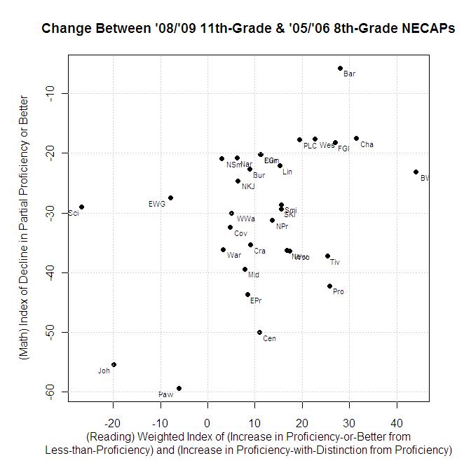
In fully technical terms, the x-axis is a weighted average, determined by…
- Multiplying each district's metric representing the increase (or decrease) in students proficient-or-better at reading calculated in Part 2 by its number of 8th-grade students who were less-than-proficient, then
- Multiplying the metric representing the increase (or decrease) in number of students proficient-with-distinction in reading calculated in part 3 by its number of 8th-grade students proficient or better, and
- Adding the products together and dividing by the total number of students in 8th-grade.
The y-axis, in all cases, in the decline in number of students partially-proficient in mathematics or better.
This plot is intended as a true index, in the sense that the numbers don't mean as much as does the information they can lead you to that explains their creation…
- Part 1: Starting from counts, rather than percentages.
- Part 2: Evaluating counts, in terms of opportunities taken and opportunities lost.
- Part 2 Take 2: Tables to accompany the graphs.
- Part 3: Going beyond just proficient in reading, settling for partially proficient in math.

 About Community Crier

 About Engaged Citizen
 Administrator