
February 23, 2010

The State of Education in Rhode Island, Part 2
The district-by-district count data, presented in yesterday's post, on changes between the 8th and 11th grades in the numbers of students proficient in reading and math needs to be compared to a measure of opportunities for change, in order to be useful for purposes of analysis and accountability. Depending on whether a change in number of students proficient was positive or negative, two possible measures of opportunities are...
- The number of students who started out as less-than-proficient, when the number of students who are proficient or better in a subject increases (net opportunities taken), or
- The number of students who started out as proficient or better, when the number of students who are proficient in a subject declines (net opportunities lost).
Since it is unlikely that all of the different possible effects balance one another out, instead of presenting results in a 1D table, the results will be presented in 2 dimensions so that -- in the spirit of a value-added analysis -- changes in groups of students who began from roughly the same place can be compared.
The y-axis of the plot below shows the percentage of students who scored proficient or better on the 8th-grade NECAPs in 2005 and 2006, i.e. the “starting point” for each district. The meaning of the x-axis changes, depending on whether the value is positive or negative…
- For positive values, the x-axis represents the change between the 8th and 11th grades in number of students who scored proficient or better in reading, expressed as the percentage of students who were less-than-proficient in that district in the 8th grade.
- For negative values, the x-axis represents the change between the 8th and 11th grades in number of students who scored proficient or better in reading, expressed as the percentage of students who were proficient or better in that district in the 8th grade.
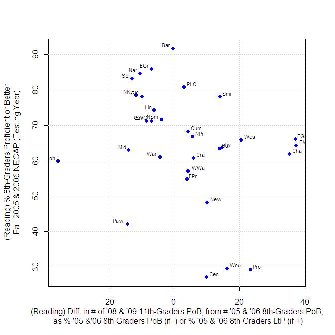
Where a district sits along the x-axis is an attempt to measure how well it did or didn’t do in the time-interval considered, with a reduced dependence on starting point. Certainly, the rankings according to the x-axis are different from the usual rankings of Rhode Island school districts. Between the 8th and 11th grades, Central Falls, Woonsocket and Providence saw the number of students who were proficient in reading increase by 10% to 23% of the percentage of students who were less-than-proficient in 8th grade. Districts that showed improvements according to this metric, within these bounds include Burrillville, Tiverton, Westerly, Smithfield and North Kingstown.
The graph above can also be read in terms of horizontal bands. The most "diverse" horizontal band lies between 8th-grade proficiency starting-points of 60% and 70%. Some districts (Bristol-Warren, Foster-Glocester, Chariho) increased their numbers of students proficient in reading by nearly 40% of their less-than proficient 8th-grade total while other districts, like Middletown, Warwick and Johnston experienced declines in the number of students proficient or better in reading -- in the case of Johnston, a very substantial decline. (And no, this is not in and of itself an argument for regionalization.)
Finally (for reading), instead of plotting the y-axis in terms of the starting point 8th-grade proficiency, results could also be plotted in terms of the final 11th-grade percentage of students proficient. Even better, both starting and ending proficiency percentages can be shown on the same plot…
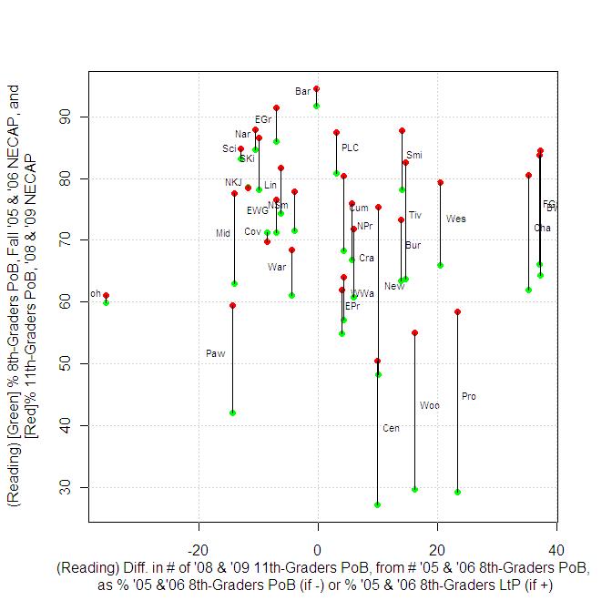
The results here are a bit counter-intuitive, as districts like Pawtucket and Middletown can experience a drop in the number of students proficient in reading while their proficiency percentages increase, because large numbers of less-than-proficient students have left the system. I would suspect much of this type of result is the result of dropout rates.
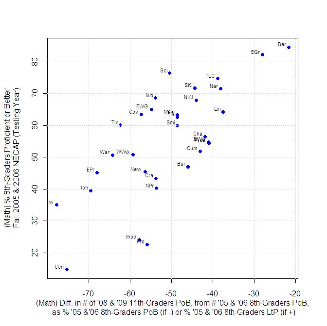
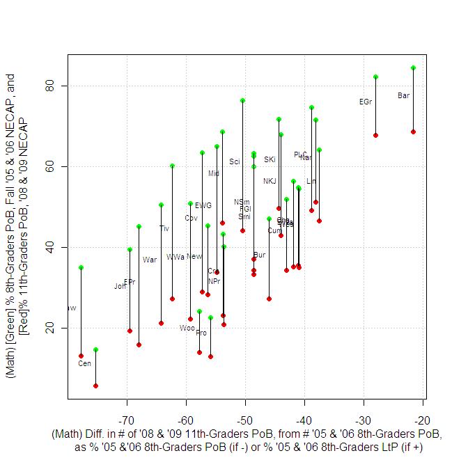
In math, because every district experienced a decline in the number of students who were proficient, in every case, we are measuring the loss from the number of 8th graders who started out proficient, and essentially looking for who declined the most or the least. The results here appear to much more directly correlate to starting proficiency than do the reading results.
(N.B.: Results for North Kingstown and Portsmouth have been corrected from the original version of this post, to correctly account for the fact that high-schools in these districts serve students from Jamestown and Little Compton, respectively.)
In Part 3, we’ll take on some refinements of data presented above, to answer 1) if we can do anything to further analyze districts that are starting from high numbers of students already proficient 2) the same question, but for districts starting from very low numbers of math students already proficient, and 3) how can we move beyond asking if a basic level of proficiency is the only thing we should be looking at?
ONLY the dimwhitted eggheads at this blog could so confuse and over analyze an issue. Are you doing so in an attempt to stick with the idea that public schools are crap due to the involvement of the nasty red unions. Perhaps you right wing tea baggers should do this much analysis to see if the low scores really mean anything and if teachers should be fired in CF as a result of them. These are the same tests that so many of you want to use to justify merit pay.
Posted by: cike mappeli [AR codenamed: Assigned Pest] at February 23, 2010 4:08 PMI did an admittedly first-step analysis of the impact of school districts on test scores, and presented a result that showed that, at least in reading, the rate of change in Central Falls may not be significantly worse than what's happening in districts like Cranston or Burrillville (when you look at the the axis that goes from side-to-side; I'd call it the"x-axis", but you would presumably find that too eggheady). However, coming in with an apparent "I don't care what any results are, we consider nothing, we change nothing" bias towards education, you missed it.
So tell me what it is you find confusing, and I'll try to explain to you.