
 Click here for the new Anchor Rising & Ocean State Current page
December 9, 2005

Economic Eye Candy
Tim Graham noticed that the Washington Post seems to have a policy of "Good Economic News on D-1, Bad Economic News on A-1" and Brian Wesbury commented last week about the ominipresent pessimism that seems to surround any and all economic news, noting:
During a quarter century of analyzing and forecasting the economy, I have never seen anything like this. No matter what happens, no matter what data are released, no matter which way markets move, a pall of pessimism hangs over the economy.This sort of spin--along with the negativity of the reporting of the Iraq War--has led to a lot of unwarranted public pessimism. Perhaps these two charts will help cheer people up.It is amazing. Everything is negative. When bond yields rise, it is considered bad for the housing market and the consumer. But if bond yields fall and the yield curve narrows toward inversion, that is bad too, because an inverted yield curve could signal a recession.
If housing data weaken, as they did on Monday when existing home sales fell, well that is a sign of a bursting housing bubble. If housing data strengthen, as they did on Tuesday when new home sales rose, that is negative because the Fed may raise rates further. If foreigners buy our bonds, we are not saving for ourselves. If foreigners do not buy our bonds, interest rates could rise. If wages go up, inflation is coming. If wages go down, the economy is in trouble.
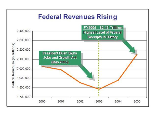
First, Treasury Secretary John Snow released the below chart (via Taxprof), which shows the increase in government revenue that has occurred since the Jobs and Growth Act of 2003:
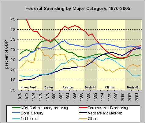
Second, Angry Bear has charted spending growth over the last 35 years:
For "supply-siders," the first graph really needs no explanation. As far as the second, Angry Bear explains:
What strikes me about this chart is that while spending on Defense and Homeland Security (the red line) has indeed risen quite sharply under the Bush administration, other types of discretionary spending (the green line) have risen only quite modestly, and are still slightly below where they were in 1995. While Bush 43's budgets have clearly benefited from low interest payments (thanks in part to the low deficits and surpluses of the late 1990s, and in part to the very low interest rates of the past few years), the one other category of spending that has grown rapidly during his presidency is government-provided health insurance.UPDATE: Don notes that the Powerline guys had a post on Angry Bear's chart, saying:So perhaps Bush is indeed no Reagan when it comes to non-defense-related discretionary spending. But neither has such federal spending grown dramatically in the past few years.
No, the only category where it seems clear that Bush has deliberately let the money flow freely is in defense. So if you think that the federal government's spending has grown too fast in recent years, turn your attention to defense spending and health care. That's where the money has been going.
This chart tends to undermine the stereotype of the free-spending, money-hemorrhaging Bush administration. If the numbers are correct, only defense and medical care have risen significantly during the present administration, measured as a percentage of GDP. The increase in defense spending is good, and the increase in medical costs is bad, but typical of what has happened at all levels of government under current law.They, in turn, got a heads up that In the Agora has a more negative takeaway from the numbers:Another way of looking at the data, of course, is to say that everything has risen as a percentage of GDP except interest and Social Security, the latter of which, at least, has nothing to do with the administration's policies.
[The] analysis is short-sighted. It fails to account for the fact that Bush's massive $400 billion increase in Medicare spending has yet to take place; it phases into place over the next 10 years. The devastating effects of Republican spending will be like the slow impaling of a dagger, not a swift jab that we can see in a real time graph.In the Agora is conceptually right concerning the economies of scale and government efficiency, but the simple fact is that the government is always expanding. Agora is also correct regarding the usefulness of the graph as far as a projection tool, but simply because history doesn't necessarily repeat, doesn't mean it is not useful.Finally, Angry Bear appears to assume that because something costs X% of the economy to function properly, it must always cost X%. Why must that always be the case? With efficiencies and economies of scale, some government costs should actually decline as a percentage, not necessarily stay the same.
Either way, looking at government spending as a percentage of the GDP in the status quo tells us very little about the long term budget decisions of a government.

 About Community Crier

 About Engaged Citizen
 Administrator


Marc,
This either gets interesting or mind-numbing. The "Jobs and Growth Tax Relief Reconciliation Act of 2003" is the same bill I referred to in this post. At the time the tax relief bill was passed, it was characterized as a $350B tax cut.
Now it turns out that the $350B tax cut has become a $300B tax increase. But since the $300B represents a smaller percentage of economic activity it is still is a tax cut.
A few questions�
How are we supposed to keep track of this stuff in a way that�s fair and transparent?
What assumptions are built into calculations about how much a tax cut will cost, or how much a tax increase will net?
At the time, Senators Chafee and Reed both thought that the 2003 tax cut was too big. Given that tax revenues have not been cut at all (they've actually gone up), do they still think the tax cut was too big?
Posted by: Andrew at December 9, 2005 5:38 PMExcellent post. Liberals should love tax cuts b/c it provides more money for the Government. It always has and it always will.
Posted by: taxcutter at December 9, 2005 8:23 PMAndrew,
I've got no facts to back me up, but it seems that there is never an accurate estimate given as to what the net increase in government revenue will be from a tax cut. This is either because people simply refuse to believe such a thing is possible, or because it's simply too difficult for economists to model. All that can be said for sure is that a tax cut will (perhaps can?) result in more revenue.
The second part is that if government receives more money as a result of the tax cut, they will be tempted to spend it. The trick is to hold the line or reduce while the revenue increases. Then pay down the deficit. However, despite what many think, it will always be good for the government to owe money. That has been realized as early as Alexander Hamilton.
I guess the take away for us amateurs is that we can generally be sure that tax cuts can result in more revenue and we'd better make sure that Congress doesn't spend it--while the going is good--so we can prevent the expectation of spending the same or more when times are bad.
OK, my head hurts.
Posted by: Marc Comtois at December 9, 2005 10:36 PMThe theory is that tax cuts stimulated the economy and therefore there was a much bigger pie to take a slightly smaller perctage of. Hence, more.
The thing that kind of pisses me off about these laffer curve debates is that they gun for optimum revenue without any respect for principle or fairness. Progressive taxation, wealth redistribution, entitlements - all bad ideas with negative consequences - but immoral to boot!
If we must have an income tax, it should be flat. Luckily, flat taxes are starting to gain footholds in parts of Europe. How ironic is is that Russia, former commies, have a flat tax in the teens while we here in the US are all about from those according to their ability to those according to their need...
demo
Posted by: demolisher at December 11, 2005 5:02 PM